Coronavirus cases plotted against test volumes in Australia using R
Coronavirus has become a serious global pandemic, infecting millions of people across the world and causing severe economic consequences. In Australia, there have been calls for the Federal Government to release its modelling. Every state’s Health Department seems to be publishing their own data and it seems difficult to obtain daily testing volumes.
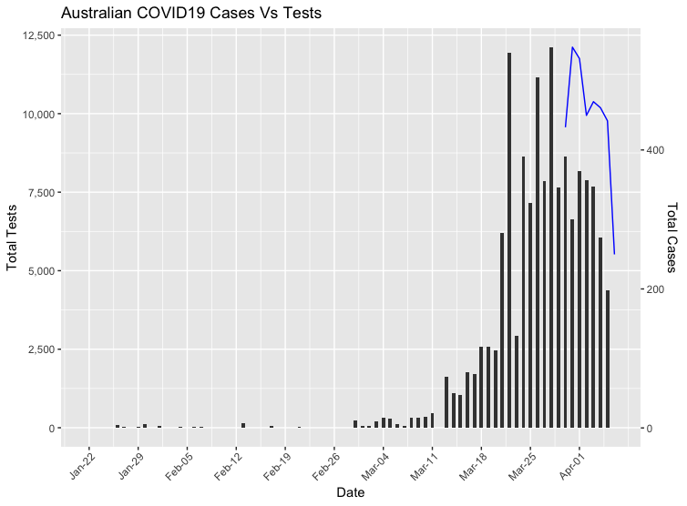
The curve is supposedly flattening in Australia, but is this due to social distancing and other measures working, or is it simply a reflection of the testing volumes on a daily basis? If we assume that the rates of testing were to decline, there would then be a reduction in confirmed cases. This would simply mean that we are capturing fewer positive COVID19 cases as the rate of community transmission and asymptomatic spread grows.
Gathering data for daily testing volumes across Australia has seemingly been a difficult task, and I have only been able to get figures from late March. It’s interesting that there hasn’t been data of confirmed cases against tests. Using the R library coronavirus, I’m going to plot this on the same ggplot using the limited data available. This COVID19 package provide raw data from John Hopkins University Centre for Systems Science and Engineering (JHU CCSE) Coronavirus repository.
First we need to load the required librabries;
1
2
library(coronavirus)
library(tidyverse)
Due to the lack of testing data availiability I’ve created a .csv with total tests Australia wide on a daily basis, sourced from COVID19-live.
1
aus_testing <- read_csv("daily-covid19-tests-australia.csv")
We’re going to make sure that our date is formatted correctly;
1
2
aus_testing <- aus_testing %>%
  mutate(date = as.Date(date))
Using the John Hopkins dataset we are now going to filter to Australian data and sum all cases across each State;
1
2
3
4
5
6
aus_cases <- coronavirus %>%
  filter(Country.Region == 'Australia') %>%
  group_by(date, Country.Region) %>%
  summarise(total_cases = sum(cases)) %>%
  select(Country.Region, date, total_cases) %>%
  ungroup()
I couldn’t find many examples where ggplot has been used with two y-axes with different scales and it turns out that Hadley Wickham believes that plots with dual y-scales are flawed. However, we’ve found a way!
1
normaliser <- max(aus_cases$total_cases) / max(aus_testing$tests)
And now we plot our data!
1
2
3
4
5
6
7
8
9
10
11
12
13
14
15
16
17
18
ggplot(data = aus_cases,
       aes(x = date, y = total_cases / normaliser)) +
  geom_line(data = aus_testing,
            aes(x = date, y = tests),
            col = "blue") +
  geom_col(width = .5,
           fill = "red") +
  scale_y_continuous(labels = scales::comma_format(),
                     sec.axis = sec_axis(trans = ~.*normaliser,
                                         name = "Total Cases",
                                         labels = scales::comma_format())) +
  labs(y = "Total Tests",
       x = "Date",
       title = "Australian COVID19 Cases Vs Tests") +
  scale_x_date(breaks = seq.Date(min(aus_cases$date), max(aus_cases$date), "1 week"),
               date_labels = "%b-%d") +
  theme(axis.text.x = element_text(angle = 45,
                                   hjust = .95))
And now we have our plot!